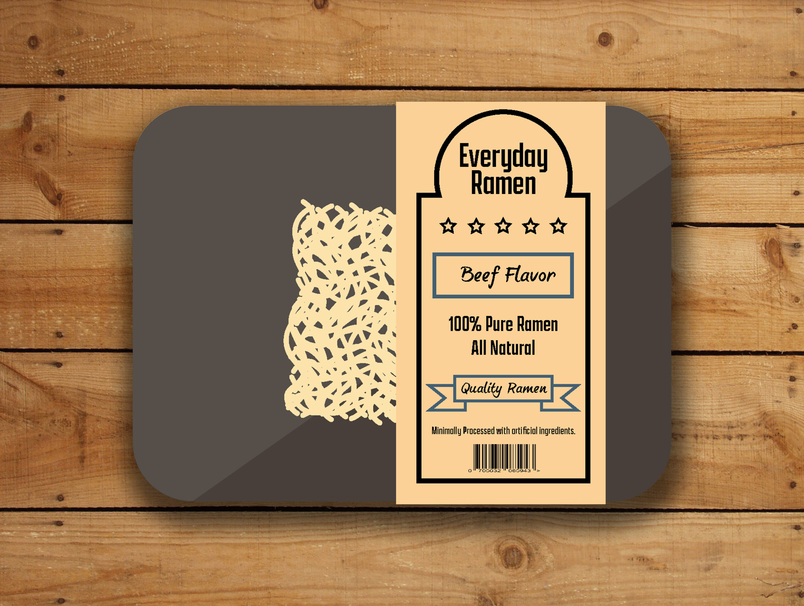
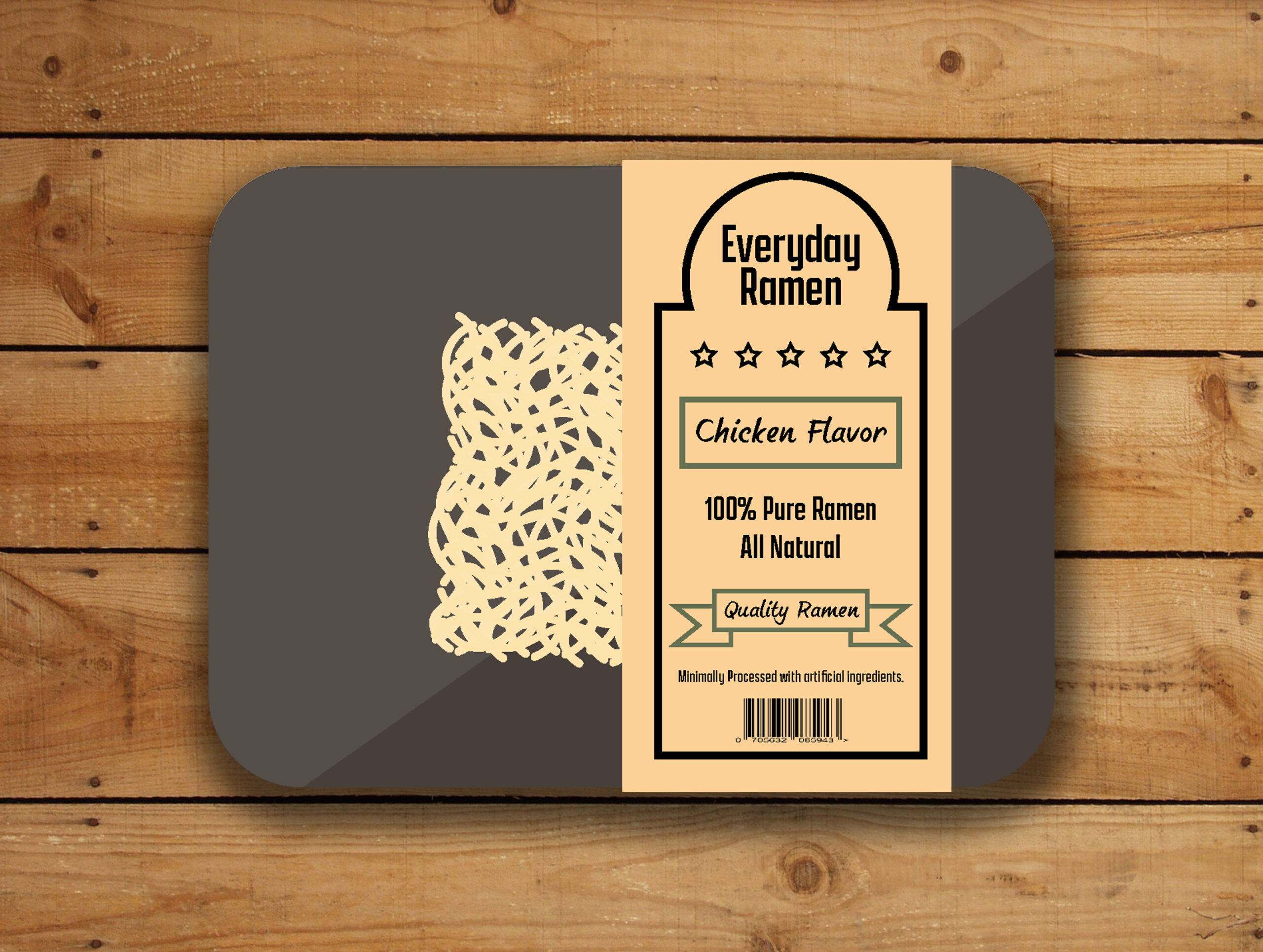
Everyday Ramen
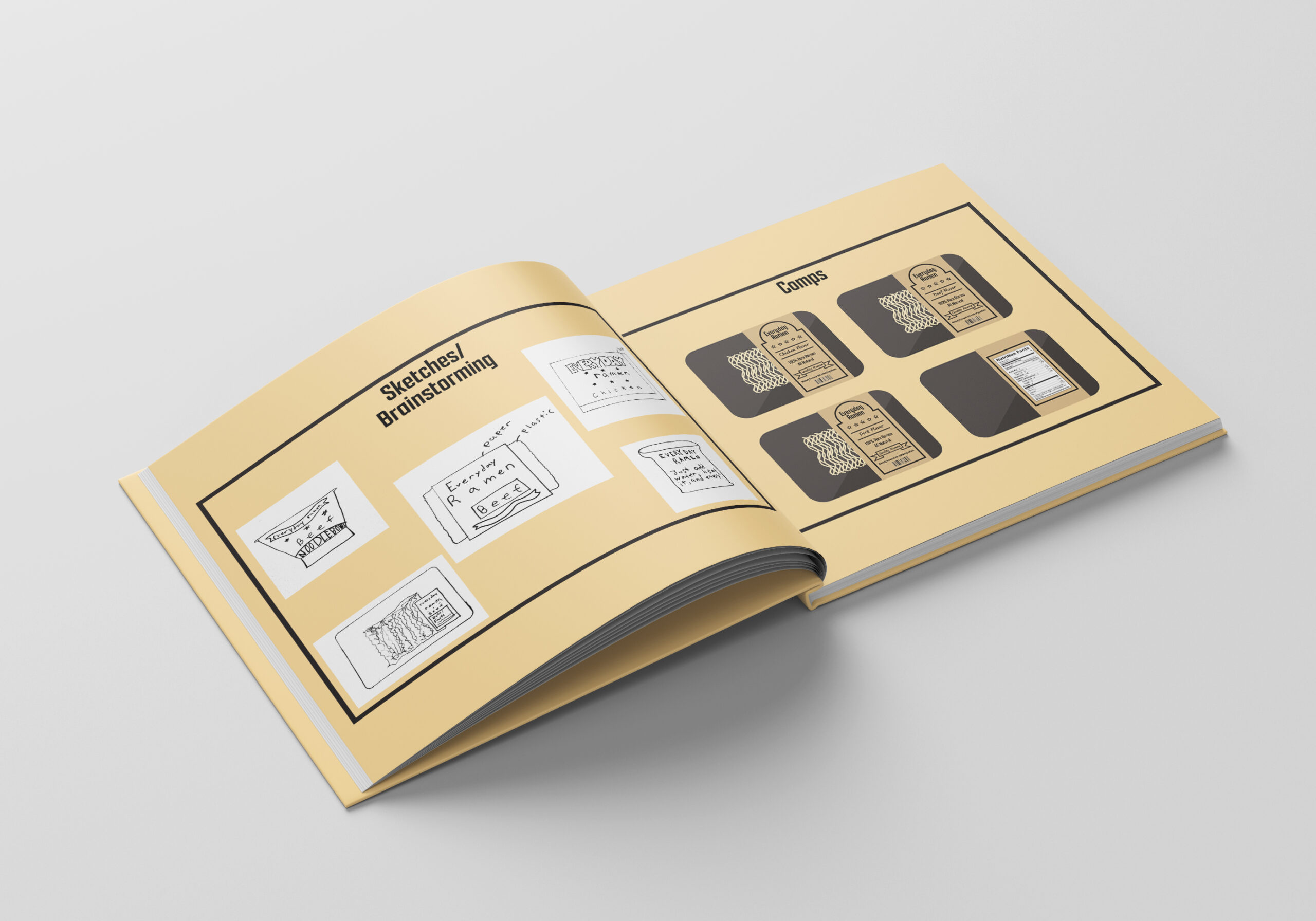
Everyday Ramens goal is to bring American and Japanese culture to American ramen. This project was created for my Branding class in fall of 2020. The overall goal is to design and develop a new package design for a modern day company. Maruchan has been dominating the market for ramen noodle sales in America for years so with that in mind I decided to create “Everyday Ramen”. This new rebrand was created to break the basic ramen noodle packaging.
The reasoning behind the unique reface is to compete with Maruchan. Customers only option when choosing ramen a basic bland looking cup of noodles. If it were to have a fancy and more expensive looking packaging, then customers feel more obligated to purchase the products. Who doesn’t want a fresh steak?
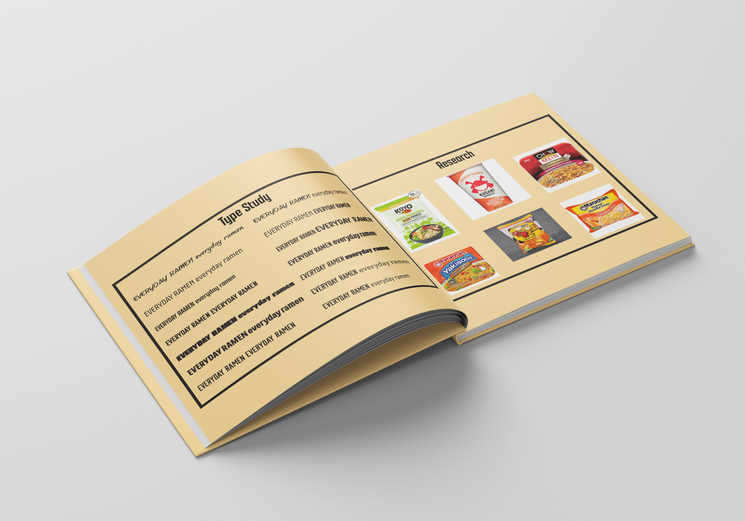
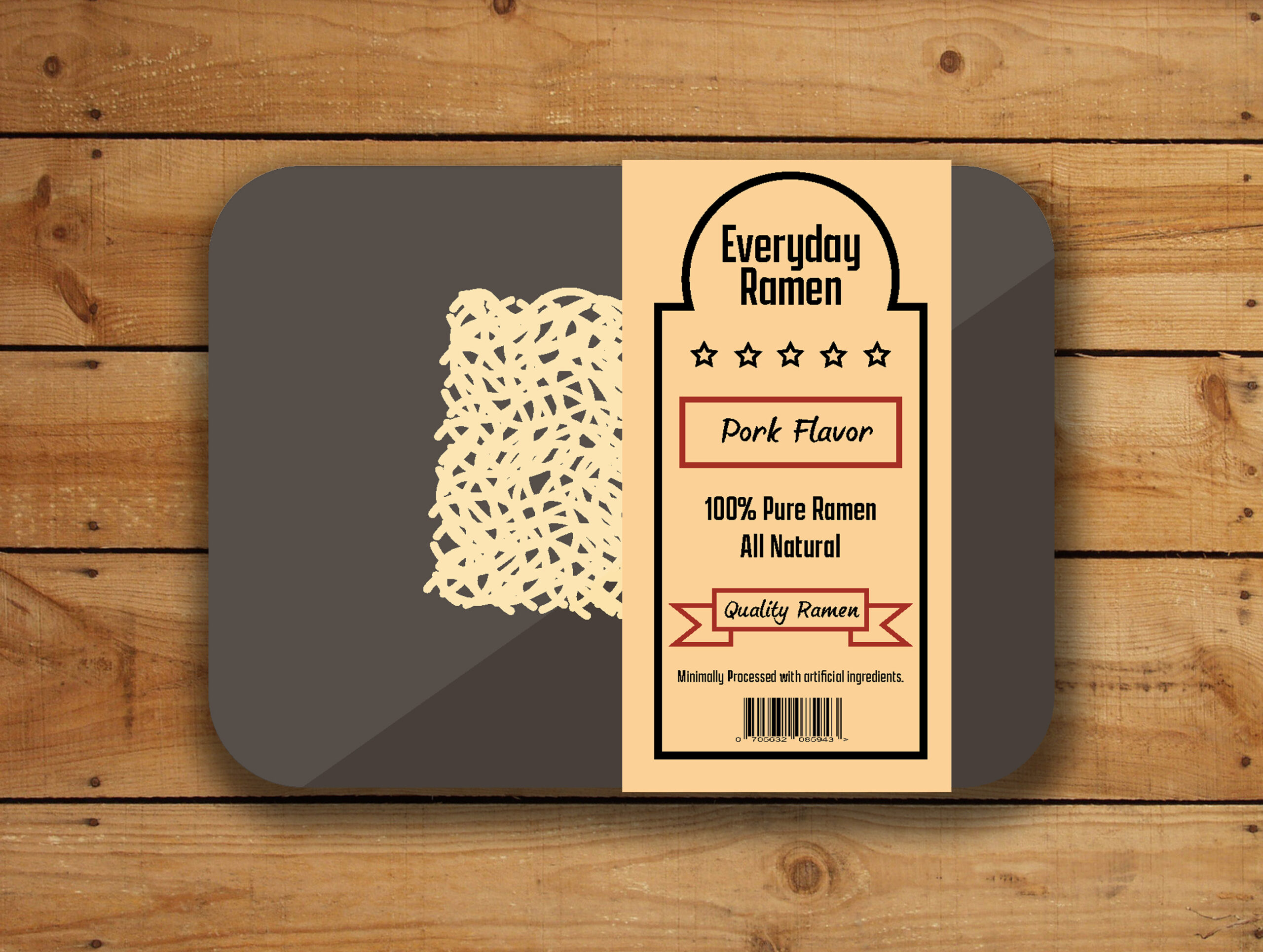
The packaging uses Japanese style fonts to give the respect of the original creators. The packaging also uses packaging that looks like meat packaging to give it that expensive aesthetic. The packaging also uses three colors to differentiate the flavors along with starts to represent the American flag. Overall the outcome is what I wanted and hits the design aesthetic I was going for.
